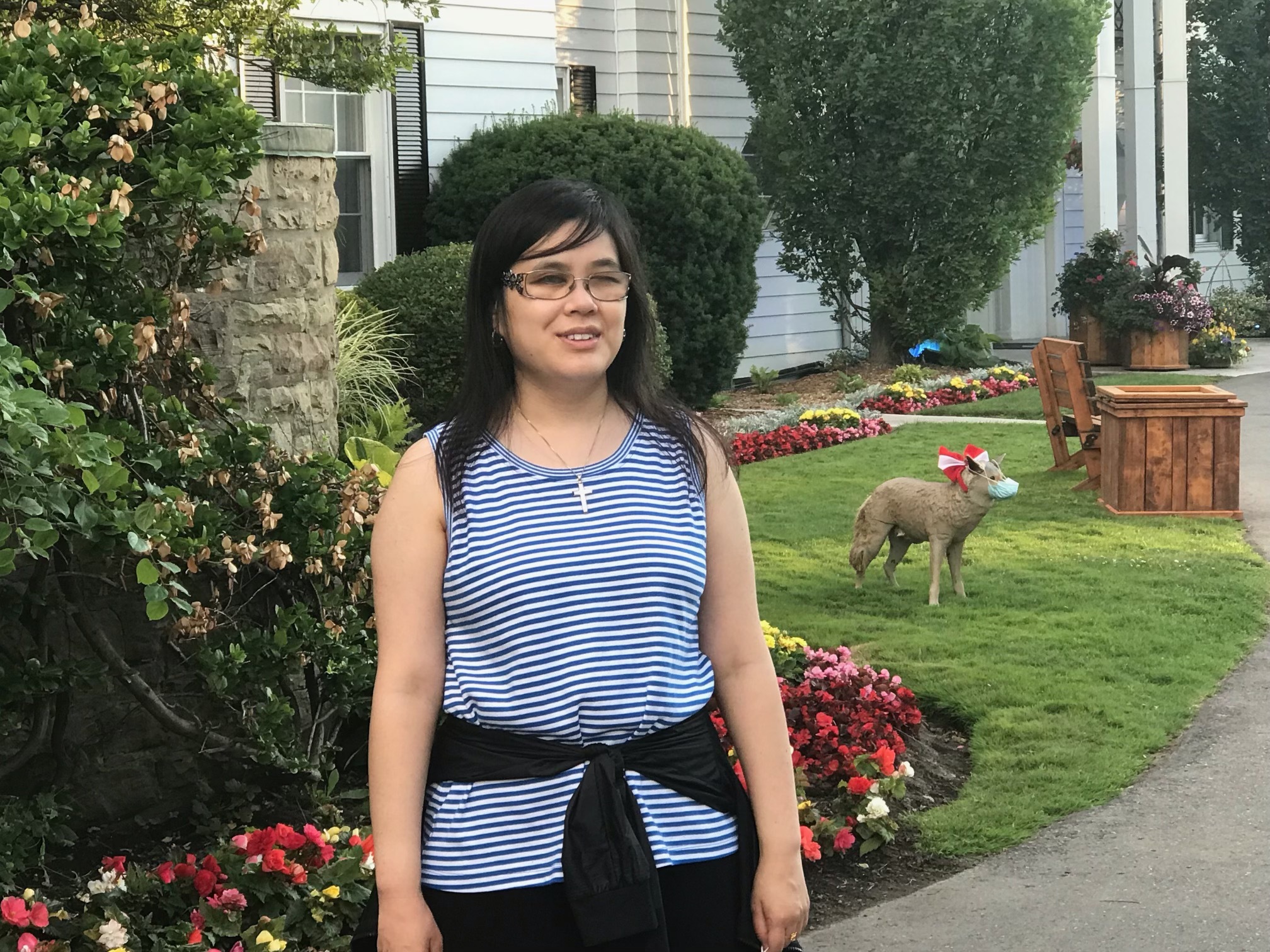
and an adorable cement puppy to her left wearing a mask and a bow on its head.
Considering the user perspective is a vital part of accessible design. In this Tech Tips post, Knowbility Digital Accessibility Specialist Iain Furstenwerth talks with Victoria Chan, who is blind and uses assistive technologies to interact with digital content.
Iain: To begin, Victoria, could you tell me a little bit about yourself, your interests?
Victoria: I am from Canada, and I graduated from [University of North Texas] with my masters in Special Ed in 2020. I was supposed to get my teaching certification, but it didn't work out because of Covid. I actually tried to do student teaching virtually last year (2021) with Texas School for the Blind, but that didn’t work out either. So now I'm looking for a job in either Digital Accessibility, or becoming a Disability Counselor/Coordinator for students with disabilities in higher ed. I might change careers and become a Sex Therapist.
My hobbies are listening to music, I love animals and pets, and I love talking to people.
Iain: You're interested in contributing to accessibility?
Victoria: Yes.
Iain: So how do you use the internet?
Victoria: I pretty much use the internet for everything. Social media, YouTube, I use the internet for everything it can be used for. I use a program called JAWS. It's a screen reader and it takes text and reads it back to you.
Iain: Do you use any other Assistive Technology?
Victoria: I use multiple forms of braille readers, including one on my phone, and VoiceOver as well.

Iain: When you visit a page you’re not familiar with, what particular feature could a developer provide that would make you breathe a sigh of relief?
Victoria: So, basically, I think the biggest thing for me is to make sure the page is formatted in a way that’s easy to read. Since I don't use a mouse on the computer, I use the tab key and arrows to navigate. So I think the easiest thing for me is to have everything in a vertical paragraph format, because if it's in a table it doesn't flow.
Iain: So you’re saying, even if a table is "accessible", it's still not ideal for…
Victoria: It really isn't. Yeah. And then, I think it's better, if you're going to do it in a paragraph format, repeat the headings so you don't have to go up and remember and find the heading. Because sometimes when I take surveys and answer questions, first of all if it's in a table that's not good. And sometimes I have to scroll up and remember what the question was.
Iain: What is a particular format, or source, or page, that you have a good time using – that is accessible for you?
Victoria: Facebook. Facebook is accessible. And YouTube, that's accessible too. And Outlook.
Iain: Good to know. Moving right along… What is the most common frustration you have because of a lack of digital accessibility?
Victoria: Sometimes I go to a page where it asks you to click a button, and when I hit Enter, it doesn't do anything. And also, some webpages have dropdown menus and stuff that you have to select. That's frustrating, too.
Iain: So again, even if dropdown menus are "accessible", they still present a barrier?
Victoria: It's really not ideal.
Iain: So to reiterate, in tech speak, if you have buttons that don't auto-focus when they reasonably should, and any dropdown menus at all, that's totally inaccessible.
Victoria: Not to mention "drag and drop". And tables. I hate that.
Iain: So to finish up, what is something you want people to know about your experience with your set of abilities, particularly on the internet?
Victoria: I can pretty much navigate the internet like anyone else, but I think for me it takes me a little longer because I have to listen. If anything is spelled wrong, like there's a typo, that really messes me up. Also, PDF files are very inaccessible with JAWS. It has to be ".doc" format.
This is the end of the interview.
Thank you, Victoria, for providing us with a unique perspective what it's like to use the internet for a person who is blind and for sharing your interest in working in Digital Accessibility.
