
It’s been quite the busy year travel wise, and I’ve had my fair share of online booking experiences. My travel included business trips to Boston, Chicago, and Austin, plus a fun, first-time ski trip to Colorado. In recent years airline websites have made major improvements in web accessibility. With these changes, booking air travel online is becoming a more enjoyable experience for me.
As a screen reader user for 20 years, a communications specialist with Knowbility, and a journalism professor at Cal State Long Beach, I’ve learned a thing or two about web accessibility. This post will highlight the features of an airline website that are crucial to an accessible experience. Note, as a blind person, I won’t be providing feedback on accessibility for low vision or color blindness. This is one traveler’s experience, but better web accessibility of airline websites in the United States is cruising at top speed. This leads to greater dignity and independence for people with disabilities.
American Airlines: A snappy homepage
This isn’t an exhaustive review of all websites for U.S. airlines. So, for simplicity’s sake, I’ll touch on my experience with American Airlines (AA), the airline on which I most recently flew roundtrip from Los Angeles to Chicago O’Hare. I’ll stick to reviewing the homepage, but be assured that I independently completed all digital tasks, including booking my ticket, reserving a meal, and checking in for my flight using the website running on Chrome with JAWS and the AA iOS app with VoiceOver.
Skip links for the win
Using arrow key navigation, the first interesting element is a list containing six items. In addition to a search text input that lets customers search the entire website, there are skip links to the navigation section, the main content area, and the website’s footer. Skip links, especially when placed at the beginning of the tab order, are enormously helpful. They allow people who use a keyboard to quickly bypass large blocks of text and other elements and reach the section of the website with which they want to interact.

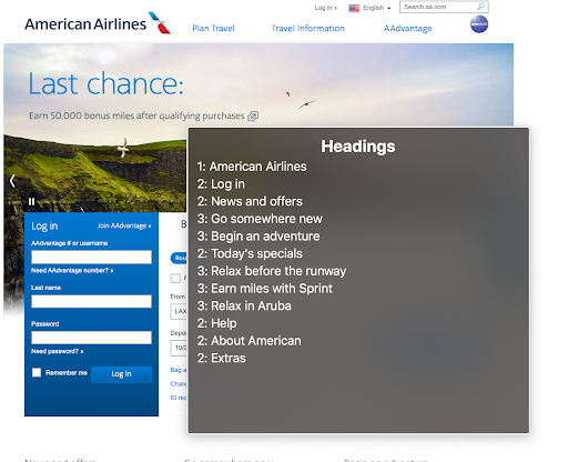
Heading structure helps to stay organized
When used correctly, the HTML heading elements H1 through H6 give screen reader users a better idea of the layout and structure of a website. AA.com’s minimal use of headings is helpful because it allows one to easily understand how the website is organized. Screen readers can generate a list of headings that are easily navigated. AA.com’s homepage has only 12 headings. So, with just a few keystrokes I can review a list of headings and am aware of the key features of the page.
Good labels keep the passenger informed
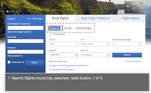
The form used to book flights requires a sizeable amount of information. This includes departure city, arrival city, dates of travel, number of passengers, and more. Having an accessible and efficient way to input all this information greatly improves the user experience. Form fields and controls with good labels are key components for achieving this goal. American and other major airlines in the US generally provide good form accessibility. AA.com includes labeled radio buttons for type of search (flight versus vacation packages) and type of flight (roundtrip versus one-way).
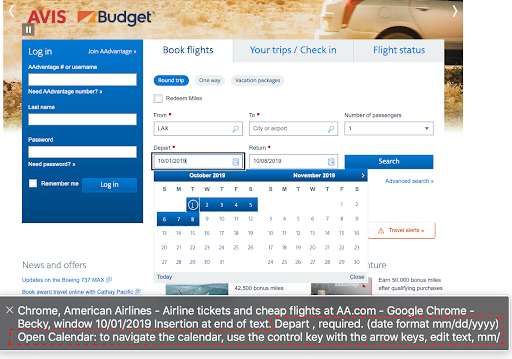
Moving through the booking form, there are labeled text inputs for departing city and arrival city. They are labeled “From” and “To,” respectively. The fields for departing and returning dates are also well-labeled and specify the format in which dates should be input. When my screen reader announces, “mm slash dd slash yyyy,” for the date format, I know to type two digits for the month, two for the day, and four for the year.
The built-in calendar allows for easy keyboard navigation of dates, if that’s how the passenger wants to input them. The added hint “to navigate the calendar, use the control key with the arrow keys,” is a nice touch that clearly instructs how to use this particular date picker. Date pickers come in all sorts of varieties, and it’s not obvious how to use one without prior guidance. I’m happy that American has really thought this process through.
The Air Carrier Access Act
In 2013 the Department of Transportation amended the Air Carrier Accessibility Act to include website accessibility. Since June 30, 2016, all public-facing pages on an airline’s website must follow the internationally recognized Web Content Accessibility Guidelines version 2.0. The law also mandates the airlines conduct usability testing with people with disabilities. This ensures that websites are not only technically accessible, but also provide a good user experience for all.
Conclusion

My experience with American Airlines and other major U.S. carriers in recent years shows that airlines are making a good-faith commitment to web accessibility. On its Accessibility page, American writes:
Whether you use a screen reader, voice recognition software or another kind of assistive technology, we want aa.com to be your one-stop-shop for all your travel. From booking to check in and everything in between, we’re making it easy to navigate our site and find exactly what you need. (American Airlines 2019)
I’m heartened to read that the airline is inclusive of other assistive technologies beyond screen readers. It is my hope that the company continues its path towards accessibility and that others do the same.
Finally, thanks to Becky Gibson, accessibility strategist with Knowbility, for help with this post. If you have questions, comments, or want to add your perspective, please let us know via email or on Twitter @knowbility. And, if you need help with all the other tasks related to accessible design, development, and leadership support, we’re here for you.