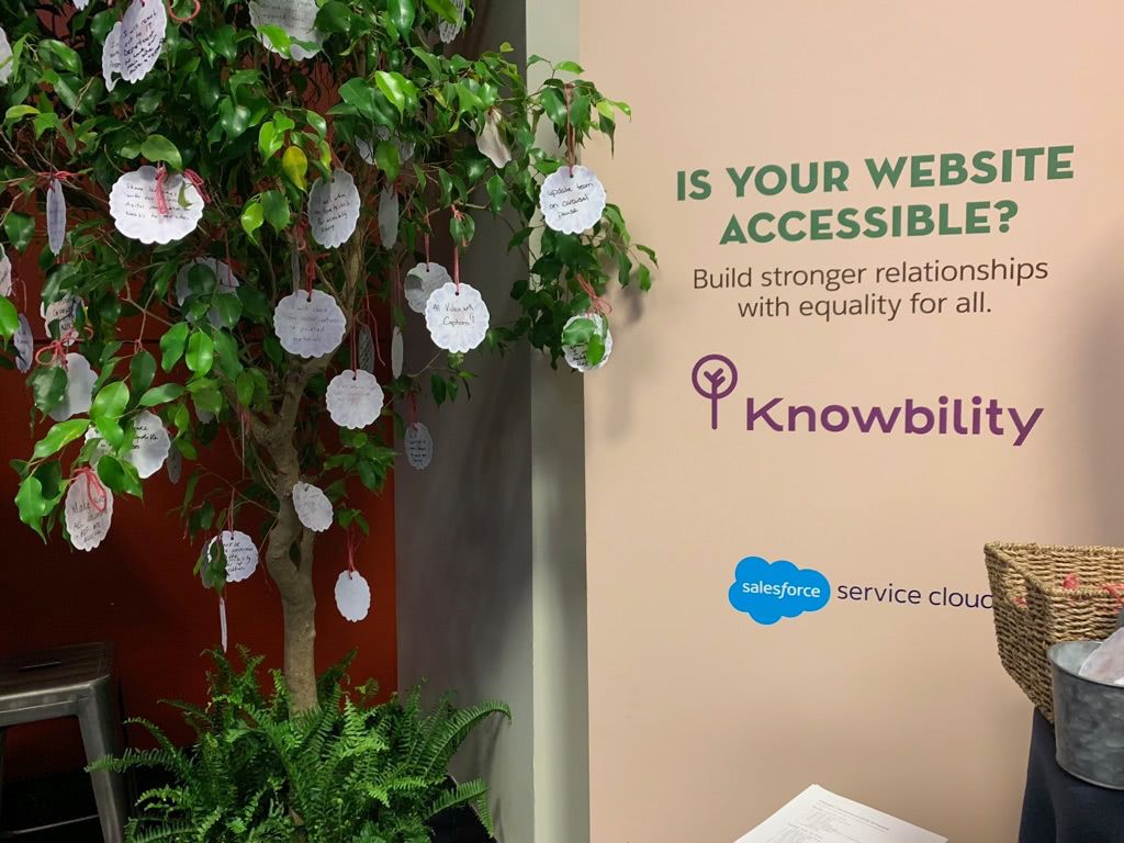
This spring, Knowbility had the wonderful opportunity to partner with Salesforce’s Service Cloud in raising awareness about web accessibility. We presented activations at the World Tour in Boston and Connections 2019 in Chicago. Becky Gibson, Senior Accessibility Strategist, and I demoed websites and talked accessibility and digital inclusion at both events. We welcome Salesforce’s commitment to accessibility.
As a blind person, digital accessibility is not a nice-to-have. It’s essential to my professional and personal successes. As a screen reader user for nearly 20 years, a communications specialist with Knowbility, and a journalism professor at Cal State Long Beach, there’s a thing or two I’ve learned about web accessibility. Below I’ll share key takeaways from our website demos and tips on how to improve the web experience for all.
The setup
Both activations used a Dell XPS-13 laptop running Windows 10. I used Freedom Scientific’s JAWS screen reader and Google’s Chrome browser. In rare instances I also used the open-source screen reader NVDA distributed by NV Access.
Connecting my computer to a large monitor gave attendees good views of the websites being demoed. In Boston, we played the computer’s sound through small, bookshelf-style speakers. Knowing that our activation in Chicago would have higher attendance and possibly have more background noise, we used wireless silent disco-style headphones. Becky and I used wireless microphones so that attendees could hear us and the screen reader simultaneously. It was an elaborate setup, and it was a smooth experience. It felt like we were on a movie set.
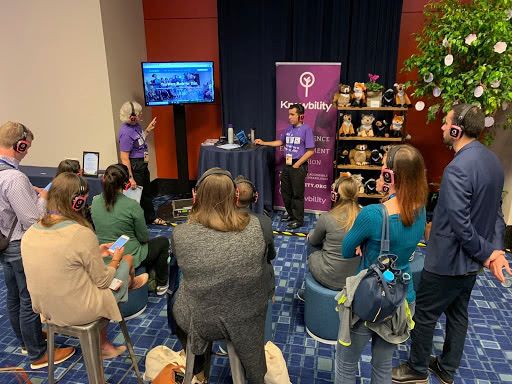
There’s something powerful about sharing how I surf the web with people who are genuinely interested in learning how blind people interact with digital technology. An in-person demo cuts through the jargon of standards and guidelines and humanizes the issue of digital inclusion. Knowbility board member and LinkedIn accessibility engineer Jennison Asuncion put it best at a recent talk in Beirut, Lebanon:
You could sit there and recite every web content accessibility guideline, hand someone a checklist, talk about the business case for why something should be accessible, but the real power is actually watching someone experience the website.
And that’s what we did in Boston and Chicago this spring.
The audience
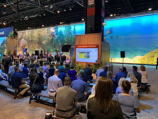
Service Cloud has a large and varied client base. As a result, we received guests from a wide range of industries including finance, insurance, retail, and higher education. Overall, I’m optimistic. Though I encountered some barriers, growing interest in digital accessibility signals to me that more people want to do the right thing and make their digital products accessible to everyone.
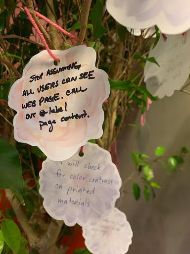
“Stop assuming all users can see (the) web page. Call out and label content.”
“I will check for color contrast on printed materials.”
Common issues encountered
Below I’ll outline some of the issues I encountered on some of our visitor’s websites. I aim to simply share my findings and not single out any company. So, my remarks are broad in scope.
Heading structure

When used correctly, proper heading structure using the h1 through h6 HTML elements lets blind people gain an understanding of a page’s structure. Using screen reader keyboard shortcuts, one can easily move among different sections of the page. Many of the websites I explored included headings, though in some cases they were used incorrectly.
Authors should use headings to break up sections of a webpage. The H1 attribute should be used for the title of a page. Headings of lesser importance should be presented at H2. Sections within these secondary sections could be presented at H3.
I noticed the use of headings to style content. When this happens, the heading structure becomes unusable because the screen reader may get stuck at a particular level. Using headings at level 1 and 3, but without level 2 can cause confusion. Headings should be organized hierarchically.
As a general rule, use only one H1. The next item should be at H2. Headings are extremely helpful in navigating long articles, lists of products on a retail website, sections of a form, and more, so by all means, do use them!
Image carousels

Interacting with moving content is a tricky proposition for screen reader users and anyone using a computer with only a keyboard. In some cases, I found carousels or slide shows that lacked any way to easily move among slides or stop the show altogether. People with vestibular disorders or cognitive disabilities also may find that moving content poses a barrier to interacting with a website.
Some recommendations include providing a pause button to stop the moving content that starts automatically and runs for more than 5 seconds. An even better option is to make a “Play” button available and let users start the slide show if they choose to do so. Labeled controls for pausing and otherwise interacting with the slideshow or carousel are also helpful.
Focus visibility
A benefit of having Becky as a sighted partner in our demos was that she caught certain visual aspects of a website which may be problematic to sighted people with disabilities. The issue of insufficient color contrast comes to mind, but an equally important issue is that of focus visibility.
People who use a keyboard and no mouse to interact with a web page use the Tab and Shift Tab keys to move through the order of a page. But when developers remove the visible focus ring, this quickly becomes a problem. With no way to know where on a page one is located, some or all tasks may become impossible to accomplish.
Most browsers include a focus ring, but often developers remove them for aesthetic reasons. Using CSS there are many ways to have attractive focus rings on your site. No matter how they look, focus rings are a critical component of web accessibility, allowing millions more users to confidently and easily interact with digital content.
In conclusion (and with gratitude)
We’re grateful to Salesforce for giving us a chance to demonstrate in-person the value that digital accessibility has on the lives of people with disabilities. We’d like to thank Service Cloud’s Director of Product Marketing Jennifer Hersom, Product Marketing Manager Mercedes McAndrew, Associate Manager Service Cloud Product and Community Marketing Conor Volpe, and everyone else responsible for our exciting stays in Boston and Chicago.