In today's digital age, creating inclusive designs that cater to all users is paramount. Accessibility in web design ensures that everyone, regardless of their abilities, can access and interact with digital content seamlessly. One crucial aspect of accessible design is color contrast, which plays a significant role in making content legible for all users, including those with visual impairments. In this article, we'll explore how to use accessible colors and create an accessible color palette in Figma, a powerful design tool favored by many designers.
Understanding Color Contrast
Color contrast refers to the difference in luminance or color between text and its background. A high contrast ratio between text and background ensures readability, particularly for users with low vision or color blindness. The Web Content Accessibility Guidelines (WCAG) recommend a minimum contrast ratio of 4.5:1 for normal text and 3:1 for large text and graphical objects and user interface components to meet accessibility standards.
Case Study: AccessU Conference Digital Tree
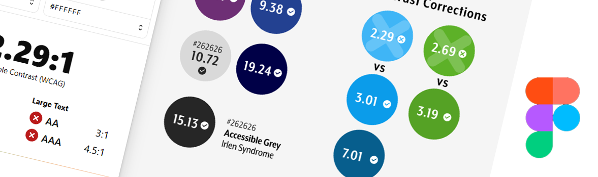
To illustrate the importance of accessible color choices, let's examine a case study featuring the digital tree design used to promote the AccessU conference. Initially, we selected colors based on aesthetics, with white text overlaid on different colored branches. See Fig 1.

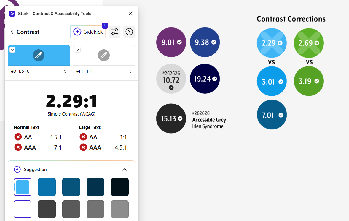
However, upon testing the contrast ratios using the Stark contrast checker plugin in Figma by Cat Noone, it was discovered that some combinations did not meet accessibility standards.
For example, the white text on a blue background (#3FB5F6) yielded a contrast ratio of 2.29:1, falling short of the recommended ratio of 3:1 for graphical objects and user interface components. To address this issue, we adjusted the hue of the blue to a darker shade (#0B9CEA), resulting in a higher contrast ratio of 3.01:1, which met accessibility requirements. Similar adjustments were made for other branch colors, ensuring optimal readability for all users. You can use the slider tool in the WebAIM Color Contrast Checker to easily do this.
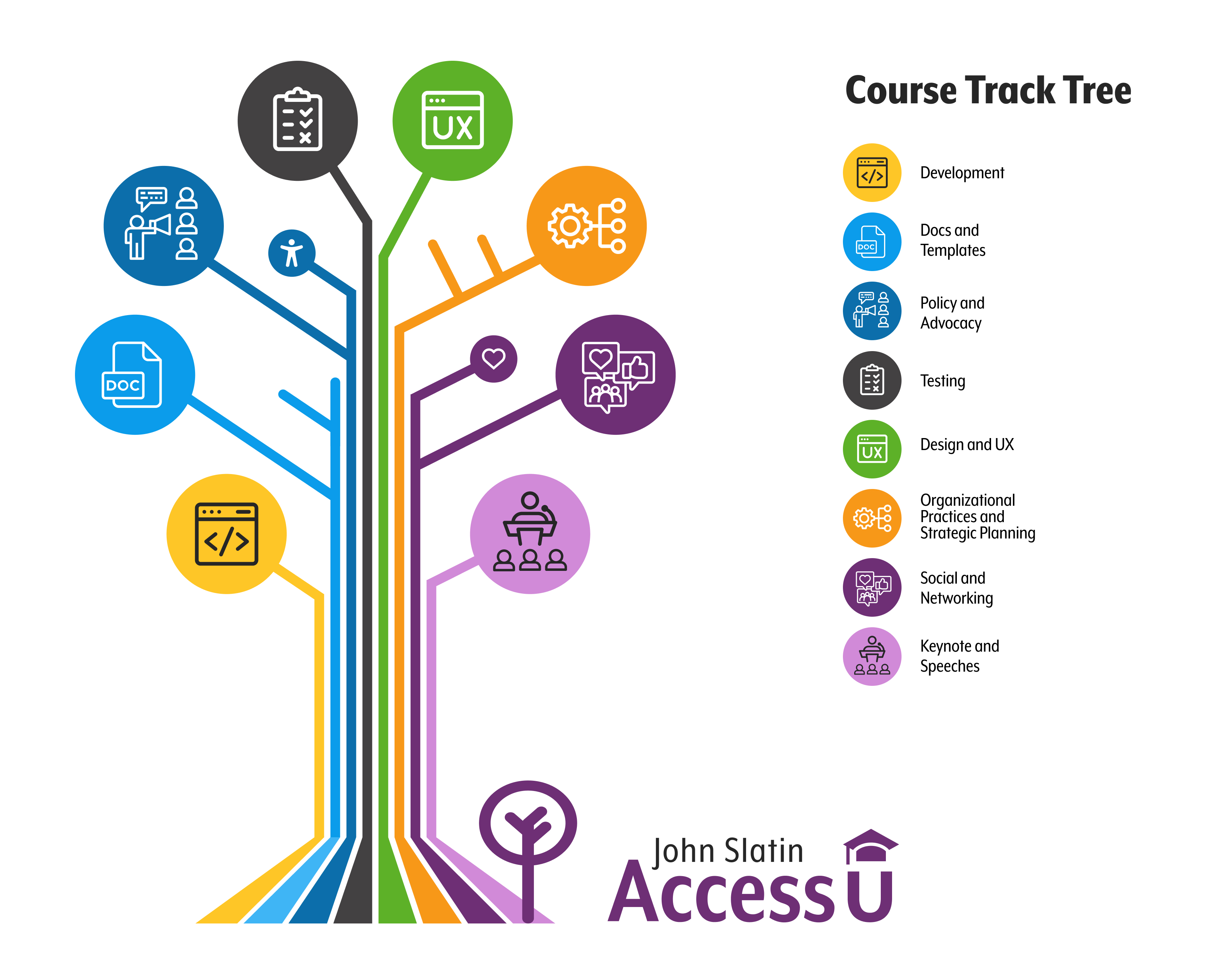
We also checked the white icon color on top of the light yellow and purple, and found the contrast there even more lacking at 1.57:1 and 2.5:1. There were a couple of things we could have done here, we could have darkened the purple for a higher contrast, but unfortunately, there is no dark yellow background that provides enough contrast without looking muddy. Read about this dilemma called the 'Dark Yellow Problem' here in an article by LodeStar Design. We decided to keep both lighter colors and to replace the white icon color with the accessible gray, #262626, a color discovered by Tamar Okail. See Fig 3. for the resulting tree with the color changes.
Creating an Accessible Color Palette in Figma
Now, let's delve into the steps for creating an accessible color palette in Figma:
1. Selecting Base Colors: Start by choosing base colors for your design. Consider the aesthetic appeal while also prioritizing accessibility. Aim for a balance between visual appeal and readability.
2. Testing Contrast Ratios: Use a built-in Figma plugin like the Stark Contrast Checker or WebAIM's Color Contrast Checker to evaluate the contrast ratios between text and background colors. Identify any combinations that fall below the recommended thresholds.
3. Adjusting Color Values: If any color combinations fail to meet accessibility standards, adjust the color values accordingly. Experiment with darker or lighter hues until the contrast ratio meets or exceeds the recommended guidelines.
4. Documenting Color Palette: Once you've finalized your color choices, document them in Figma using color swatches or styles. Include the contrast ratios for each combination to ensure consistency and accessibility across your designs.
5. Iterative Testing: Continuously test your designs with real users, including those with diverse abilities, to validate the accessibility of your color palette. Iterate and refine as needed to improve usability for all users.
Designing with accessibility in mind is not only a best practice but also a moral imperative. By prioritizing color contrast and creating accessible color palettes in tools like Figma, designers can empower all users to access and engage with digital content effortlessly. Remember, accessible design benefits everyone, regardless of their abilities, and fosters a more inclusive online experience for all.
For reading more about AccessU 2024 and the courses offered in each track this year, visit the AccessU 2024 page here!